Introduction
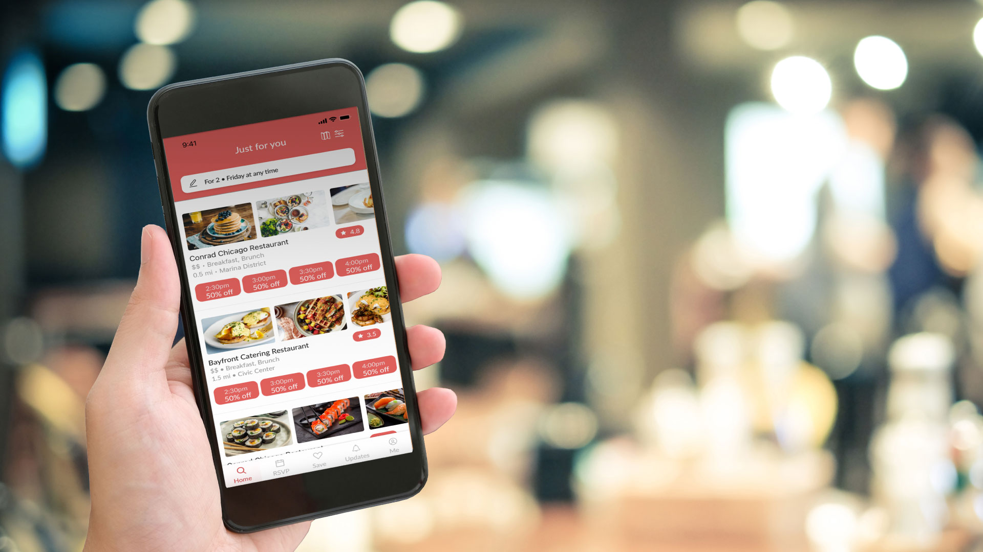
In an effort to boost restaurant profitability during off-peak hours, Timeats was conceptualized with the aim of seamlessly connecting diners with discounted reservations. By offering time-based discounts ranging from 10 to 50 percent, the app targeted slow days, such as Mondays and Tuesdays, and slower months, like September. The objective was to not only fill empty seats but also encourage repeat visits by providing a positive dining experience.
My role
As a multi-faceted contributor, I played the roles of UX Researcher, UI/UX Designer, Branding Designer, and Design Strategist to create a user-friendly solution.
Opportunity
The opportunity identified was to leverage time-based discounts for restaurants to attract customers during off-peak hours, coupled with an effortless reservation process.
How does it work?
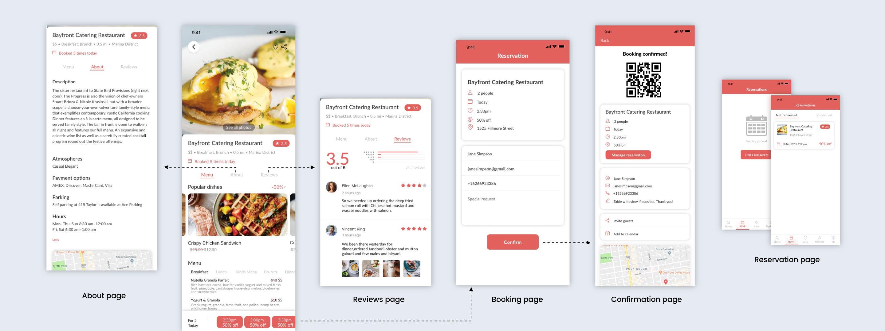
No upfront costs or coupons are needed - just make your reservation, attend it and your discounts will be automatically applied to your food bill.
Competitive Analysis
Breaking down Timeats’s business model into Reservations (OpenTable, Yelp) and Discount Deals (Groupon, LivingSocial) categories.
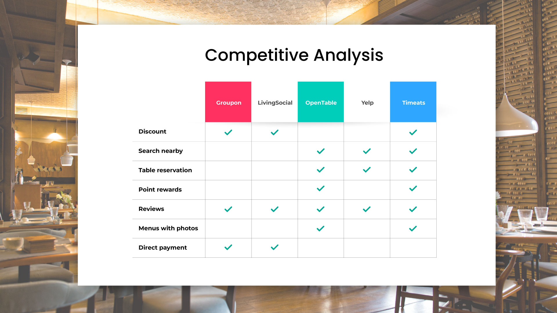
Analyzing pivotal user reviews provided valuable insights into areas for enhancement and potential opportunities:
- No upfront deal.
- Quality of the service
- Restaurants can't choose which time customers will come in for using their discount deal.
- Not many restaurant options.
- Allow users to book on the day that restaurants are close and not inform them.
- No honest review system.
User Insights
Insights derived from user interviews and market research emphasized the significance of discounts for off-peak dining. Notable findings included the preference for discounts among 8 in 10 consumers, with a potential for them to return during peak hours if satisfied. Additionally, the challenges faced by new restaurants, the dominance of mobile bookings (72%), and the frustration with high bills during dining out were recognized.
User Persona and Journey
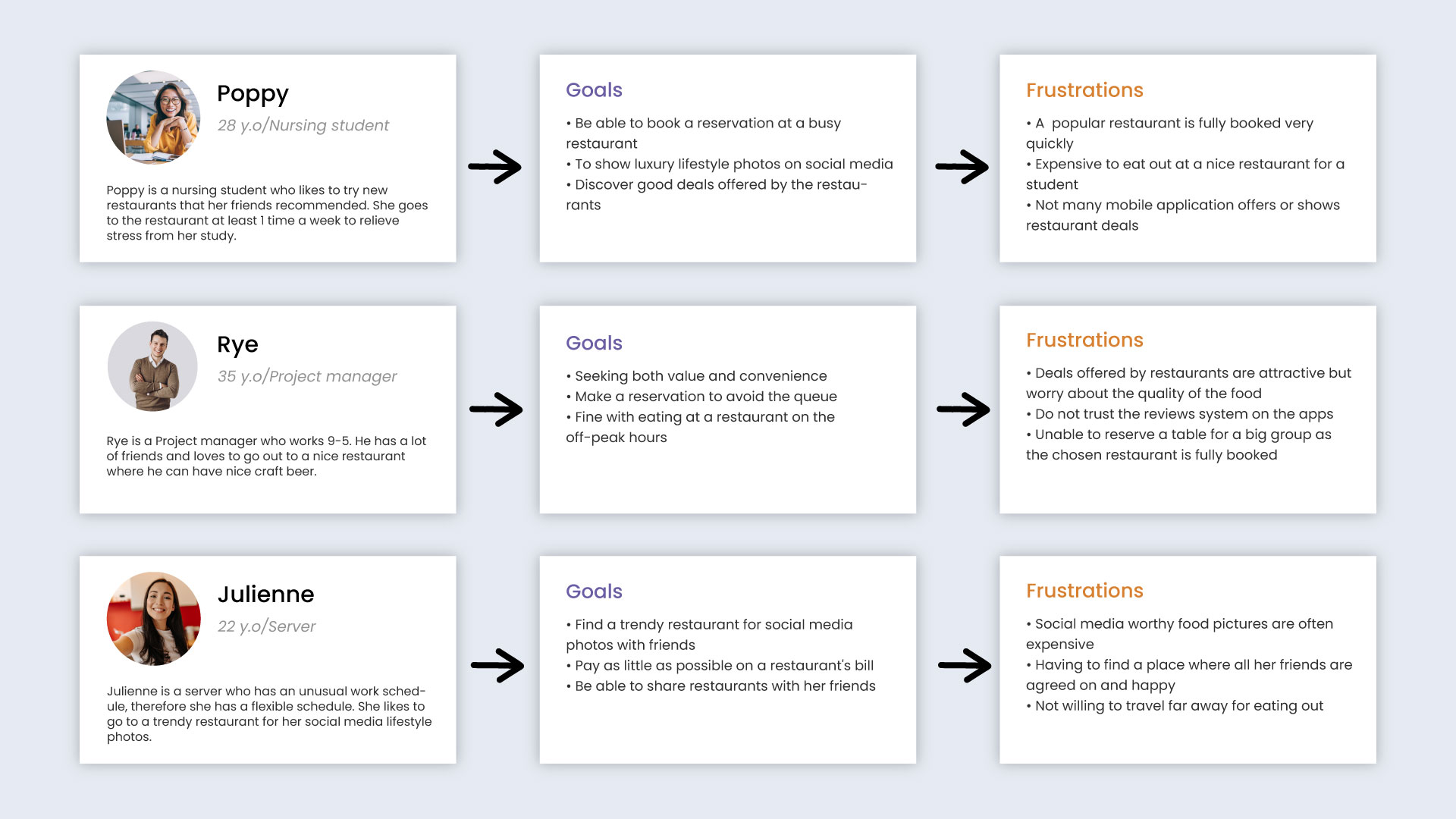
By defining three distinct personas, the focus was on Poppy, a representative user. The user journey map reflected Poppy's experience, aligning with identified pain points and preferences.

Wireframe
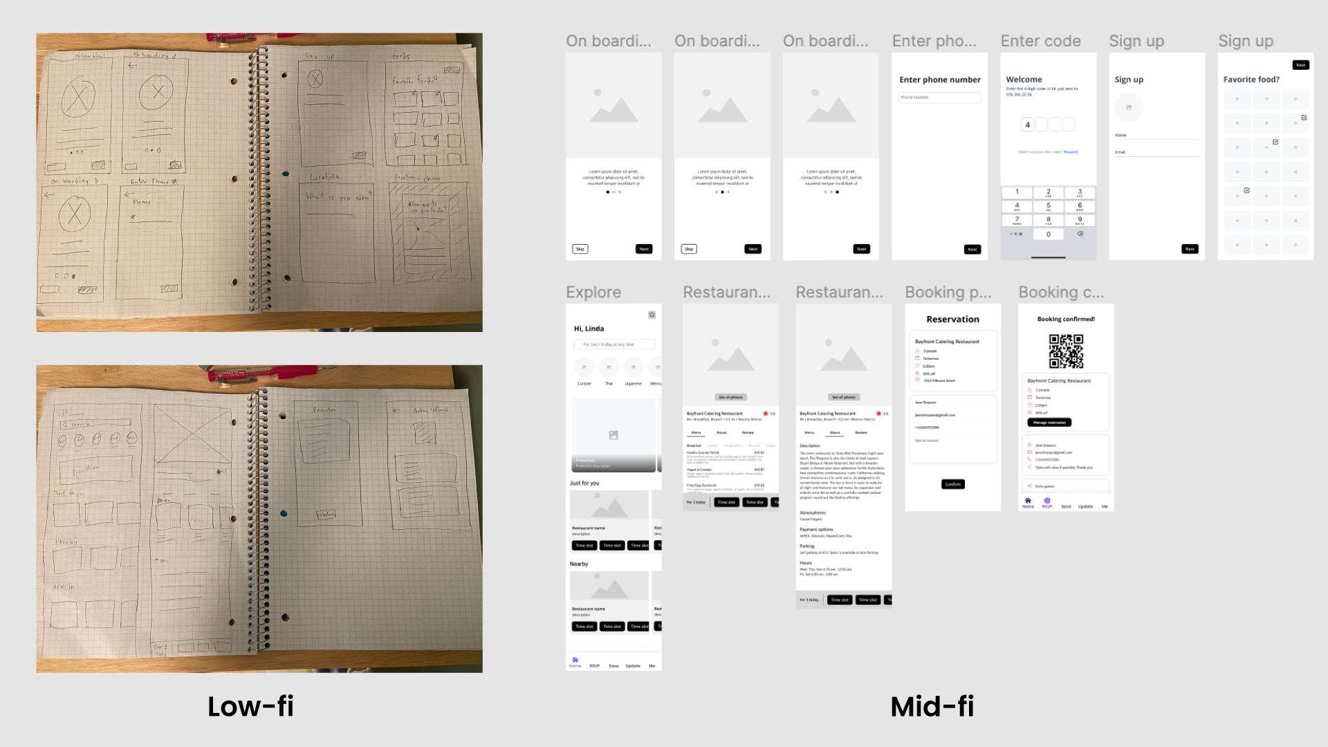
Starting with pen-and-paper sketches, I transitioned to digital wireframes. The iterative process allowed the creation of a seamless user interface, considering the identified pain points and feedback from user interviews.
High-Fidelity
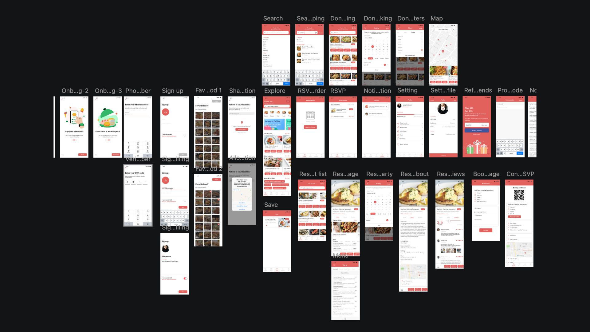
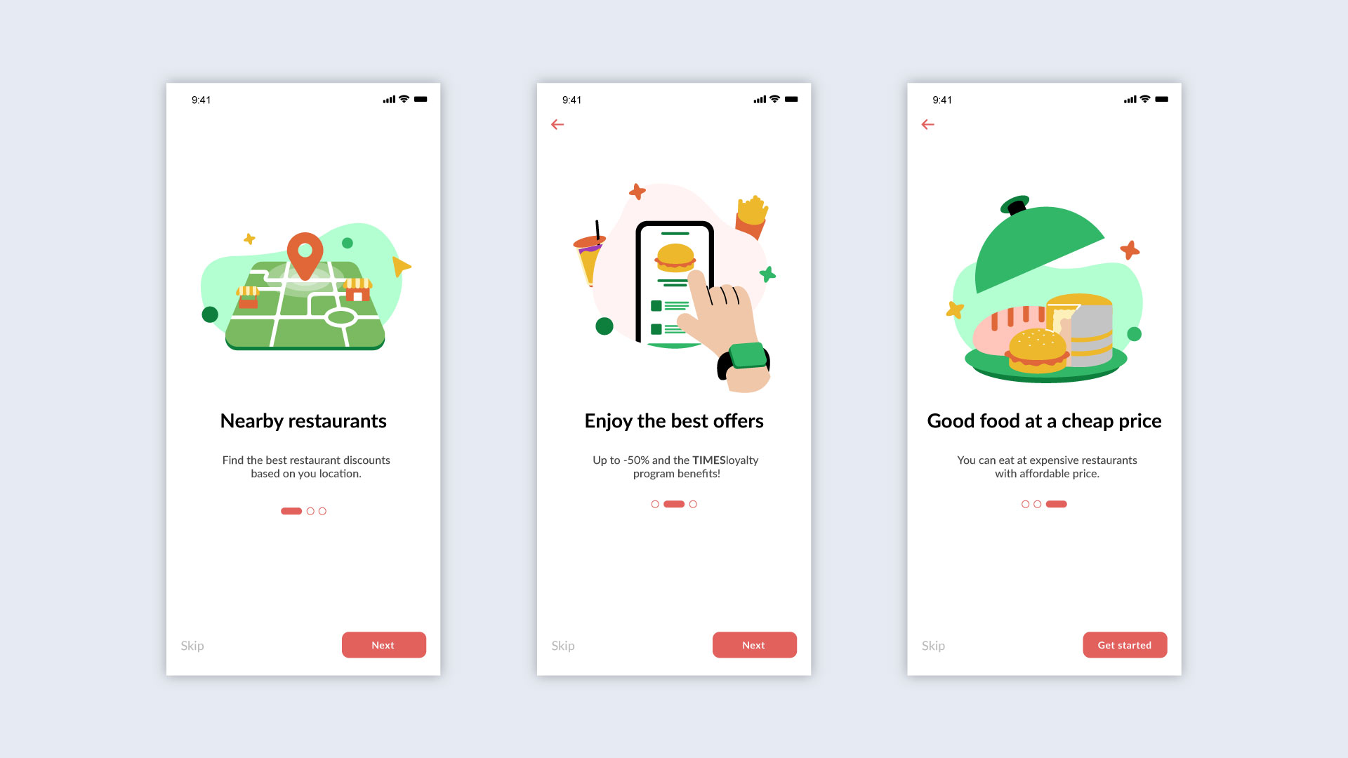
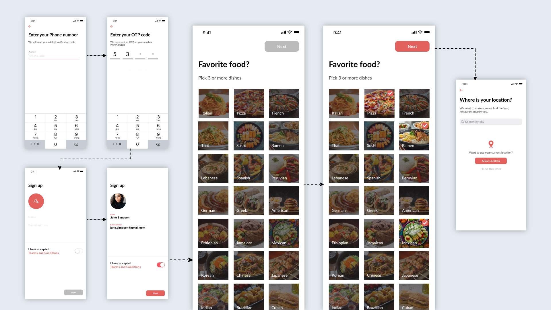
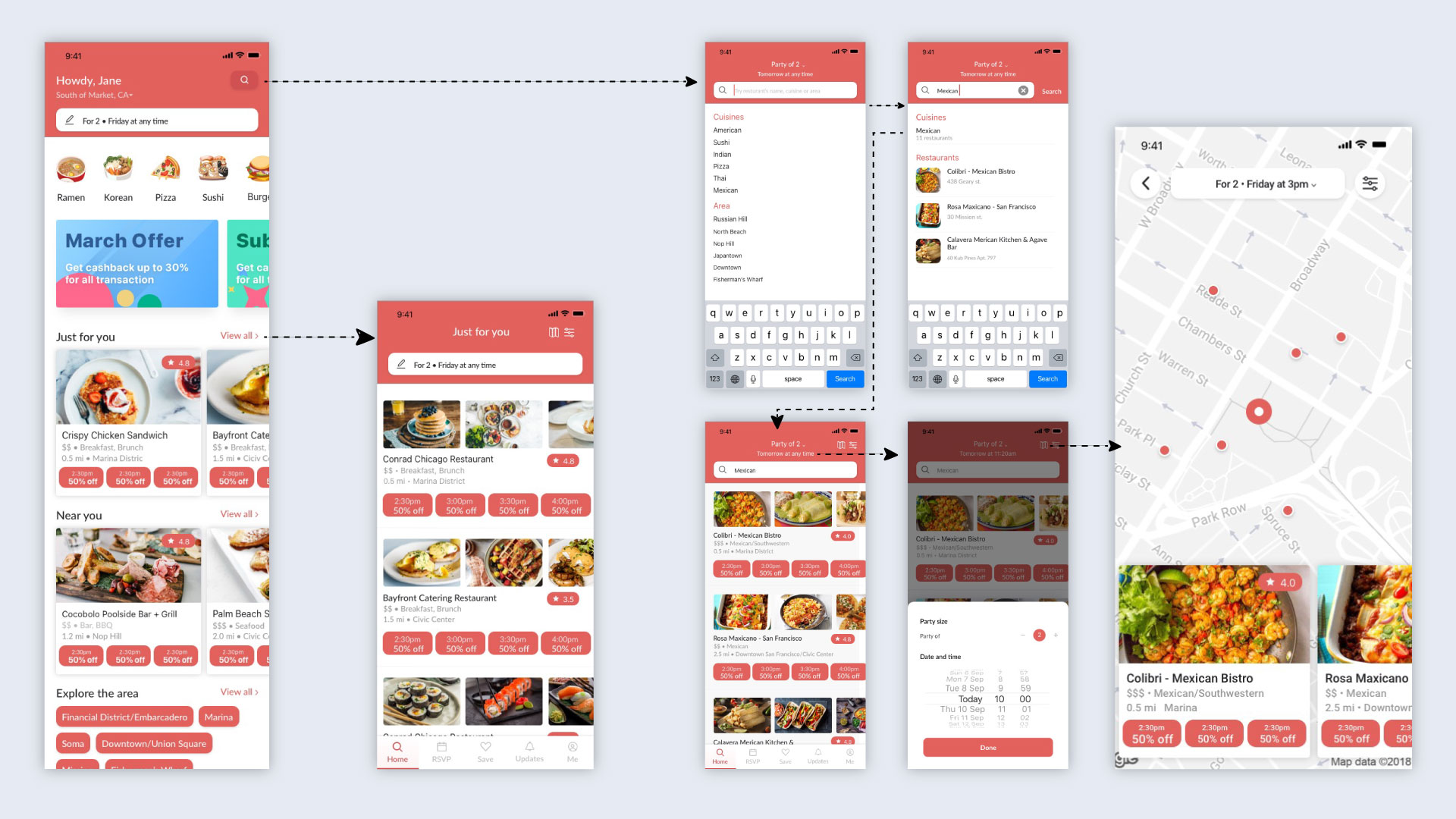
Incorporating inspiration from Pinterest, the high-fidelity design prioritized simplicity. Key screens such as onboarding, registration, explore, search, reservation, and review were meticulously crafted to enhance the user experience.
Reflection and key takeaways
This is a project that I came up with from start to end. I have worked in the restaurant industry and noticed that restaurants have many hours throughout the day on a regular basis where there are little or no customers. My friends also were always looking for deals. I combined these ideas to come up with my own app concept. Throughout the process of exploring the idea, and designing the app I learned many things.
Simplification over Complication
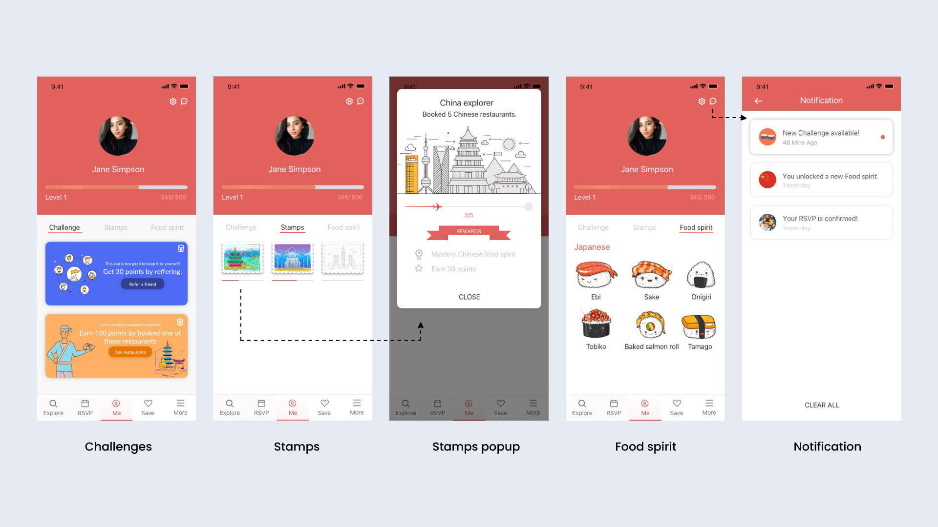
Acknowledging the risk of feature overload, I streamlined the app by discarding the initially planned gamification elements. Instead, I opted for a straightforward loyalty point system to maintain user engagement.
Remote User Interviews Challenges
The pandemic necessitated remote user interviews, presenting challenges such as the absence of visual cues. This experience emphasized the importance of meticulous preparation for effective questioning and understanding user motivations.
Conclusion
Timeats stands as a comprehensive solution, addressing the challenges faced by both restaurants and diners during off-peak hours. The strategic use of discounts, paired with a user-friendly interface, positions Timeats to revolutionize the dining experience and bridge the gap between restaurant profitability and consumer satisfaction.

